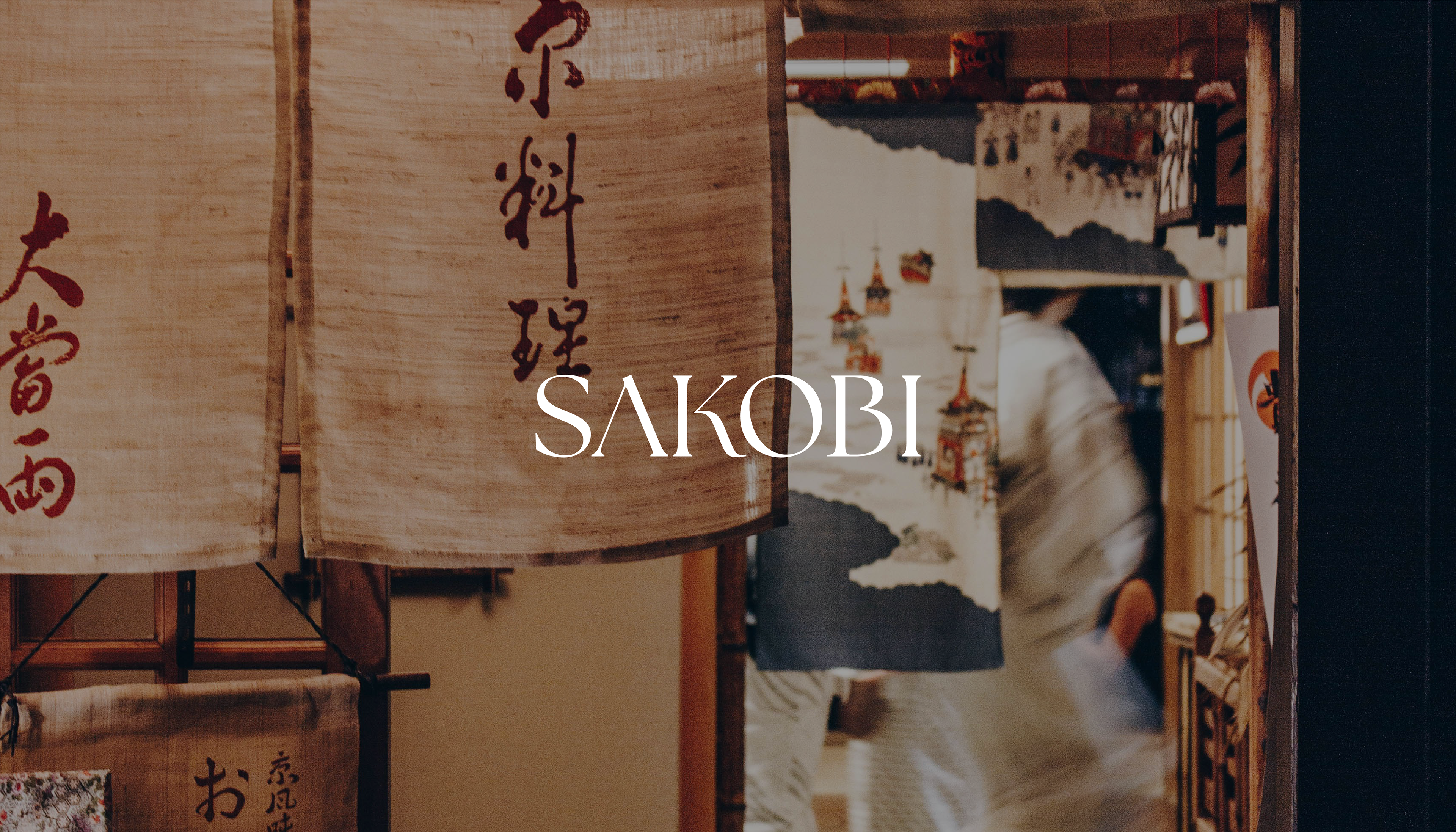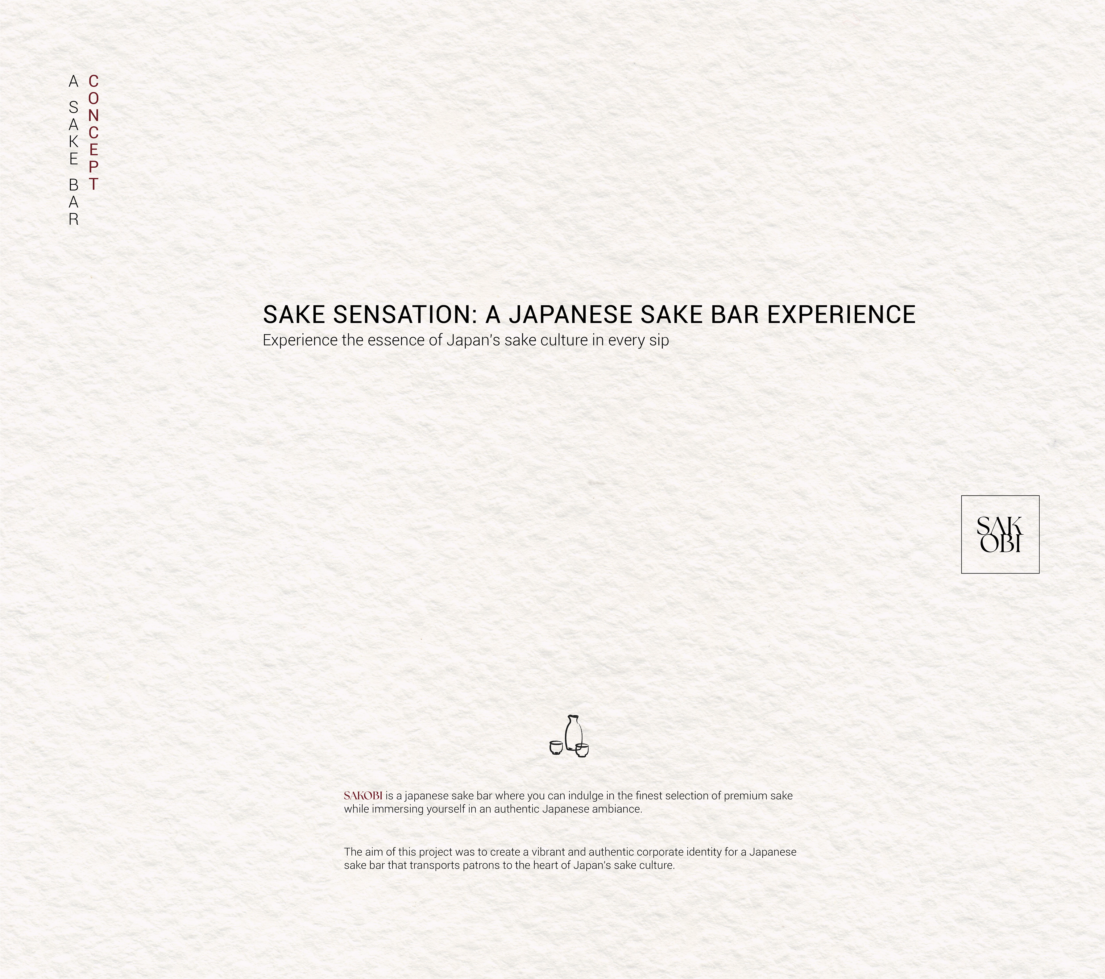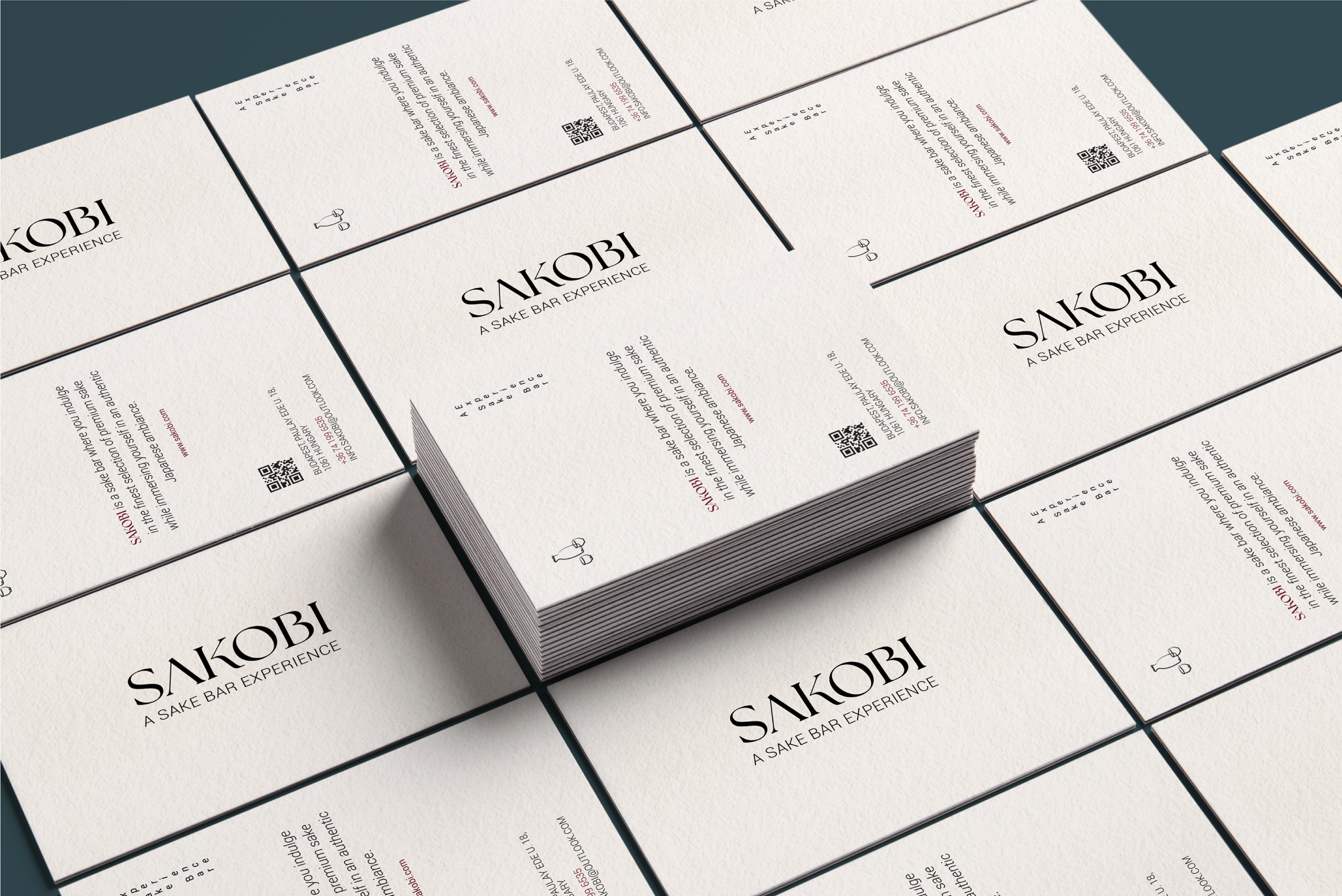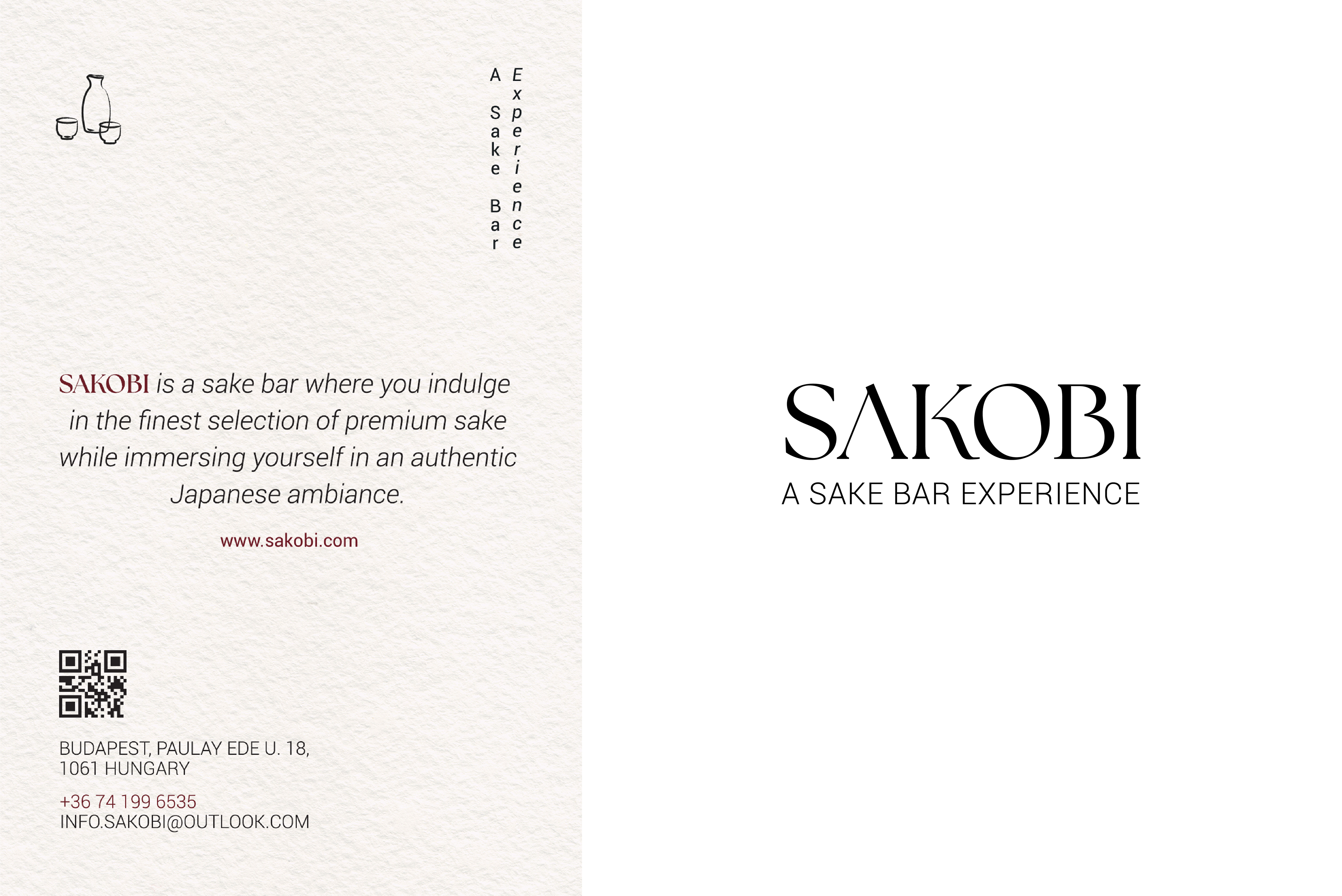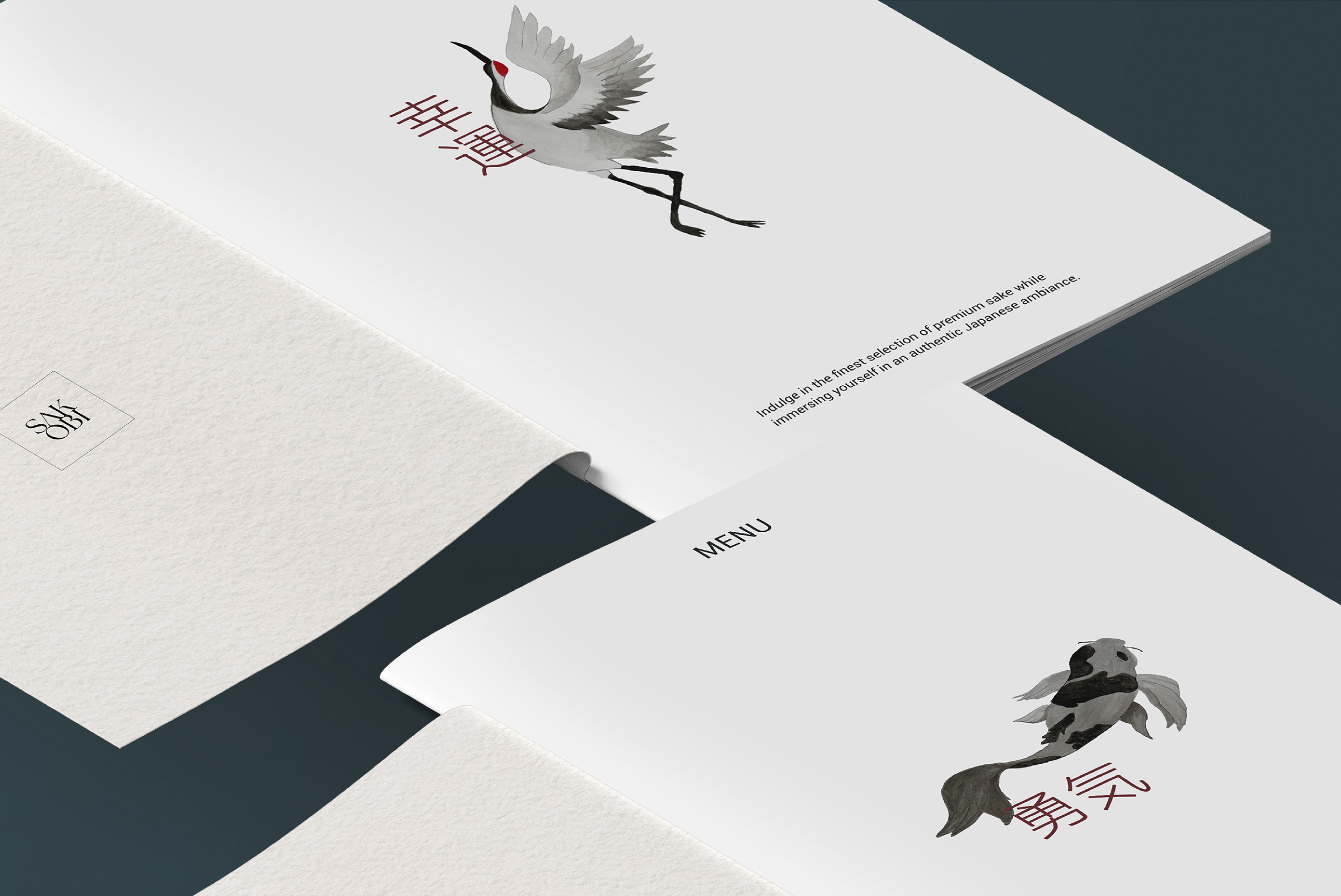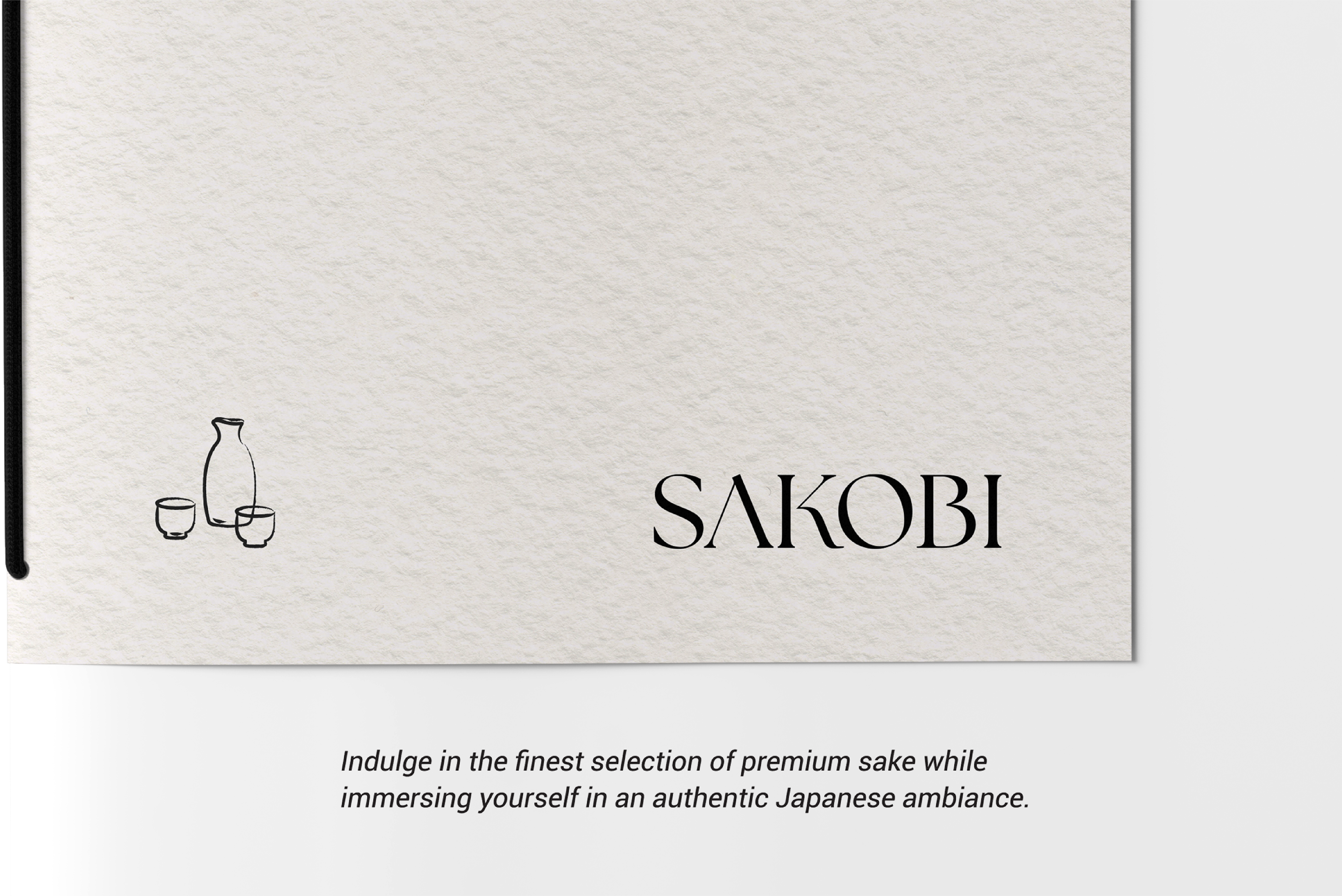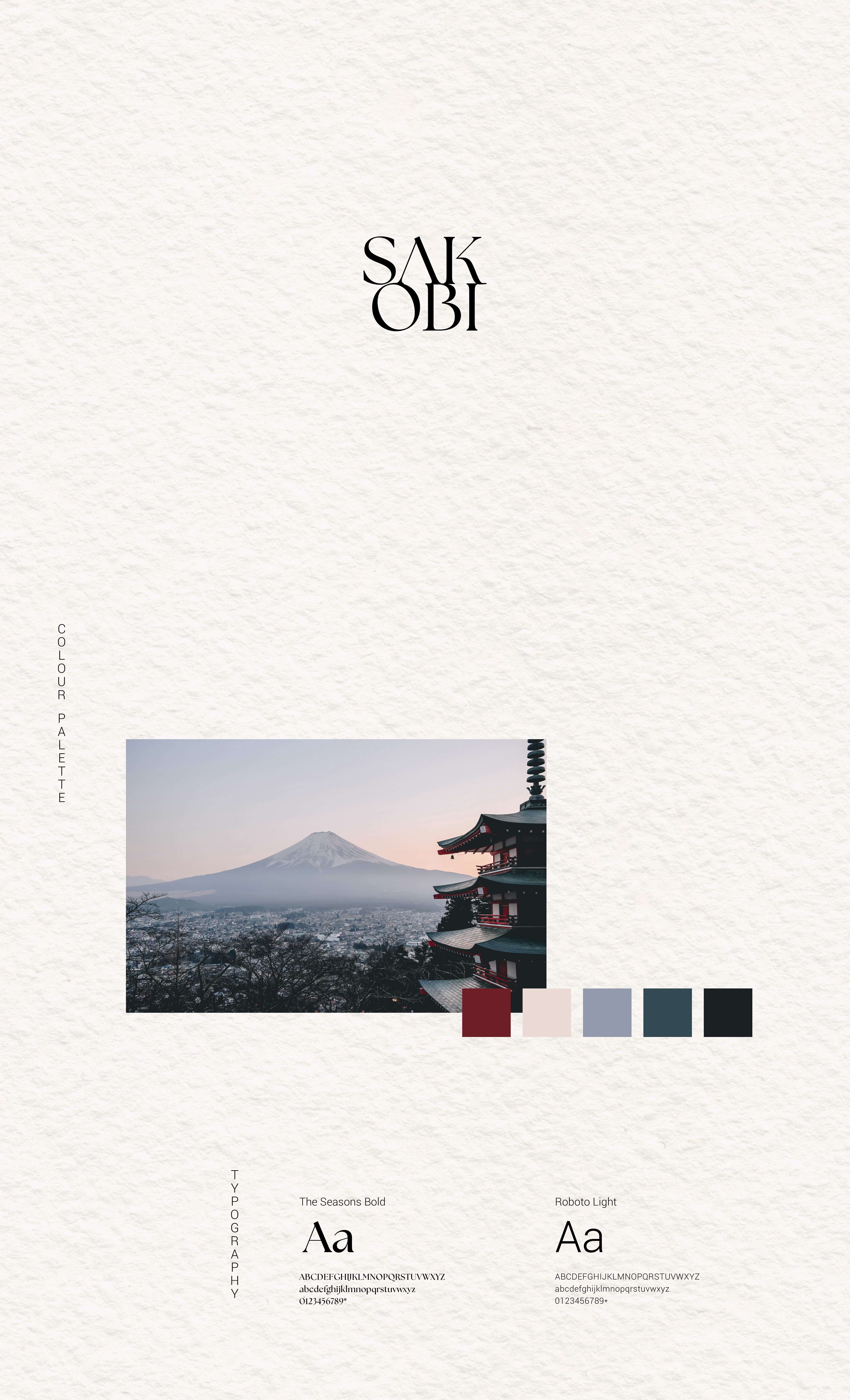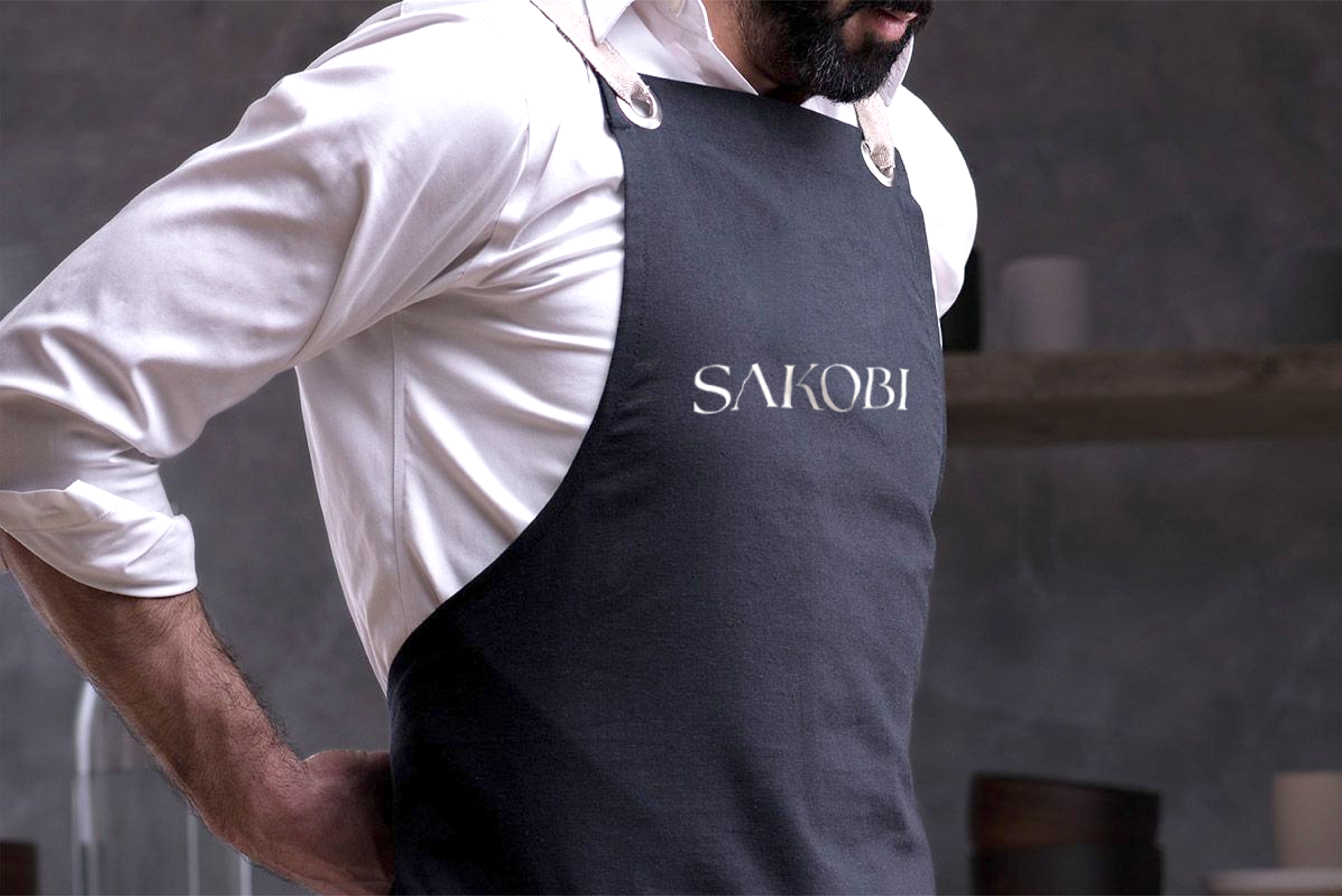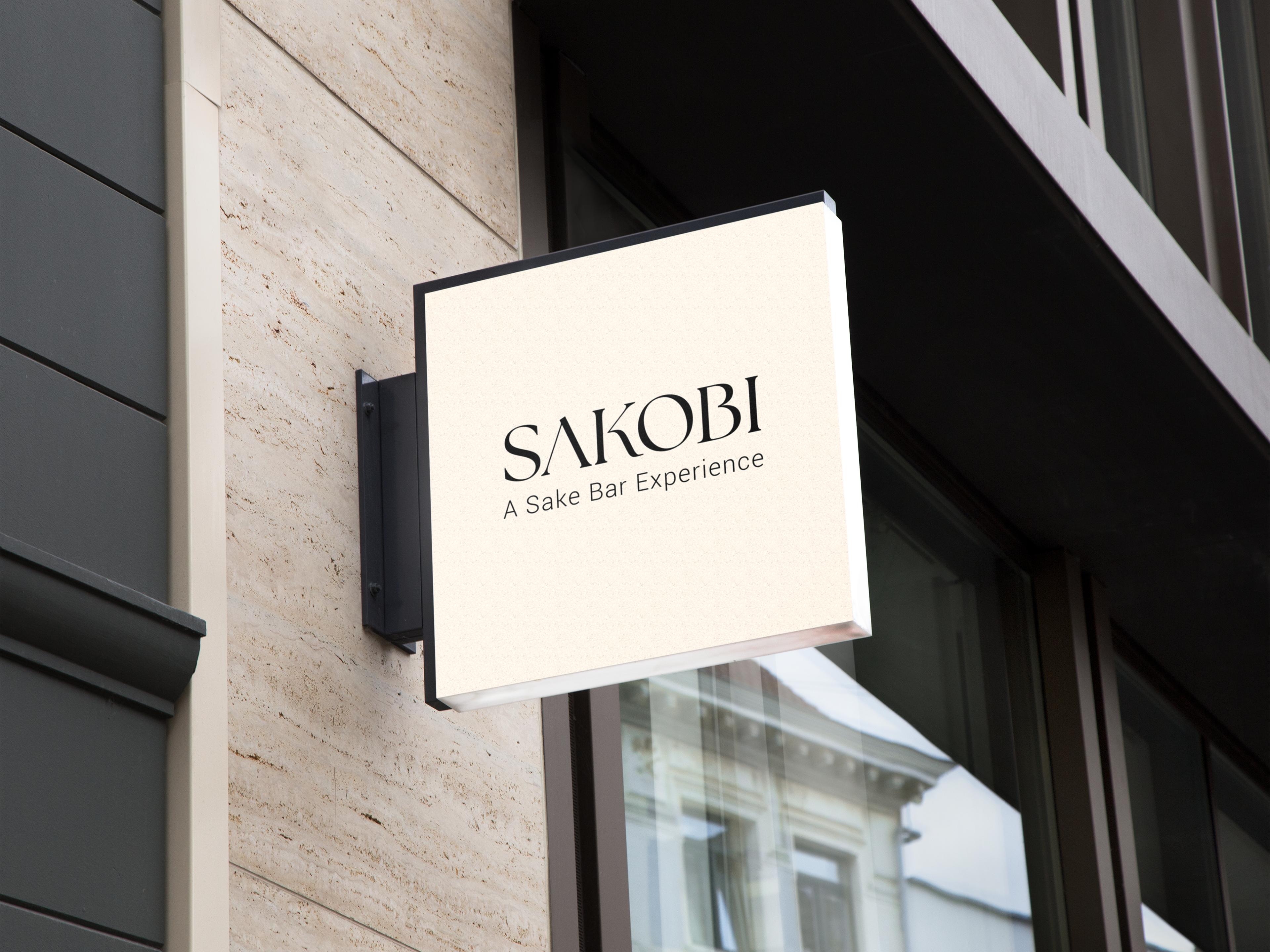
I created a modern and sophisticated corporate identity for Sakobi. The elements include a logo, colour palette, typography and hand-painted images. These elements are rooted in Japanese culture and sophistication, communicating the quality of the sake sold and the service expected.
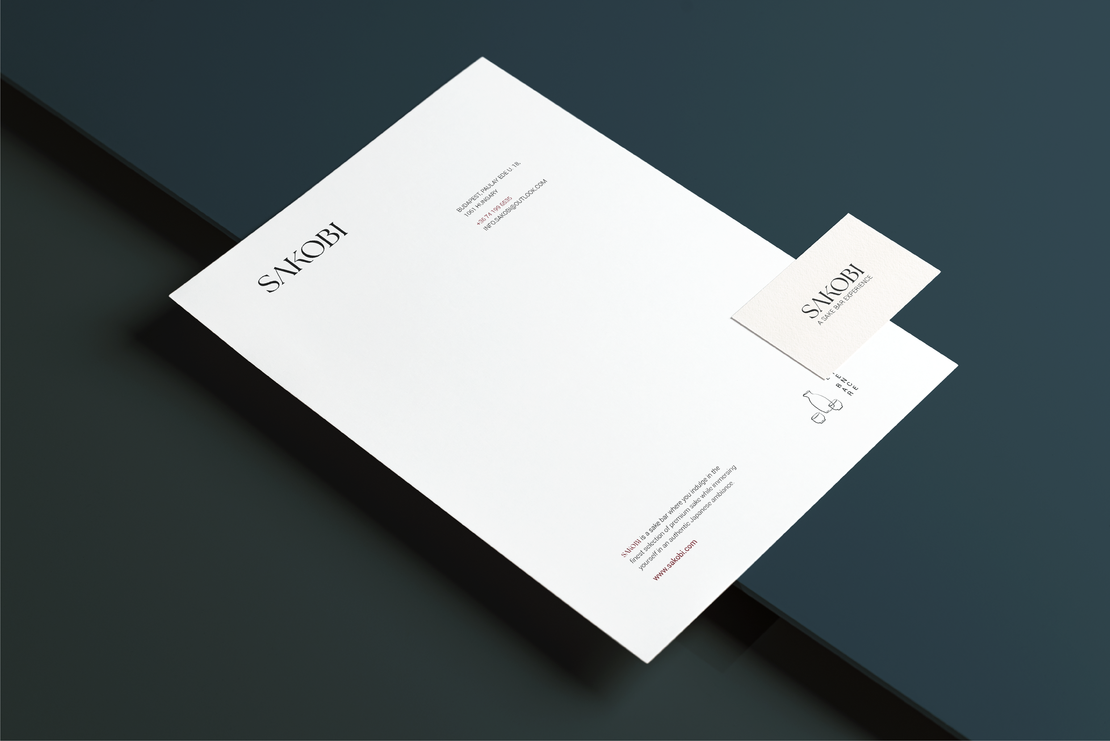
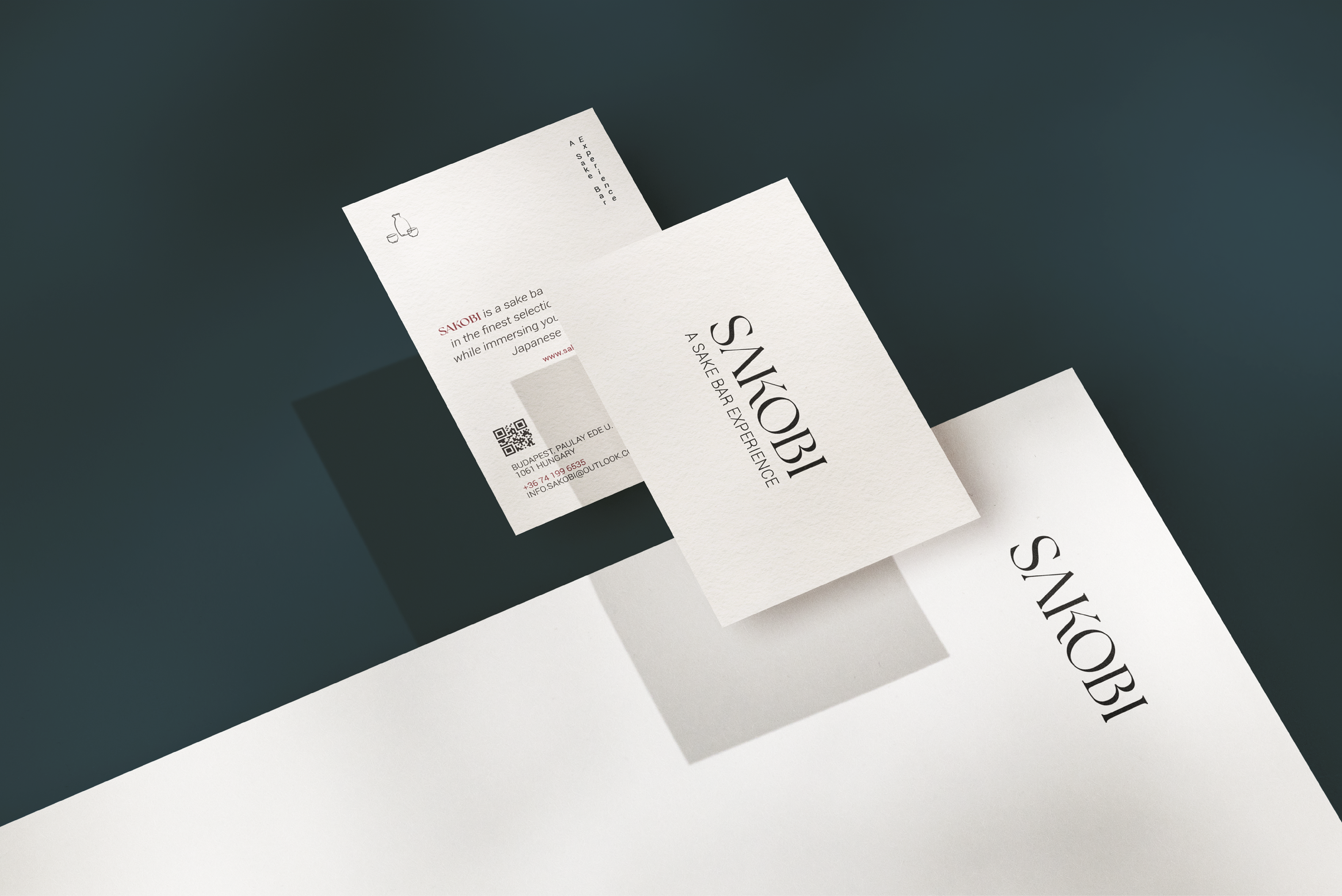
The wordmark was created using an elegant font which was then manipulated to stand out and be unique. The logo has three variations to be used to fit different formats.
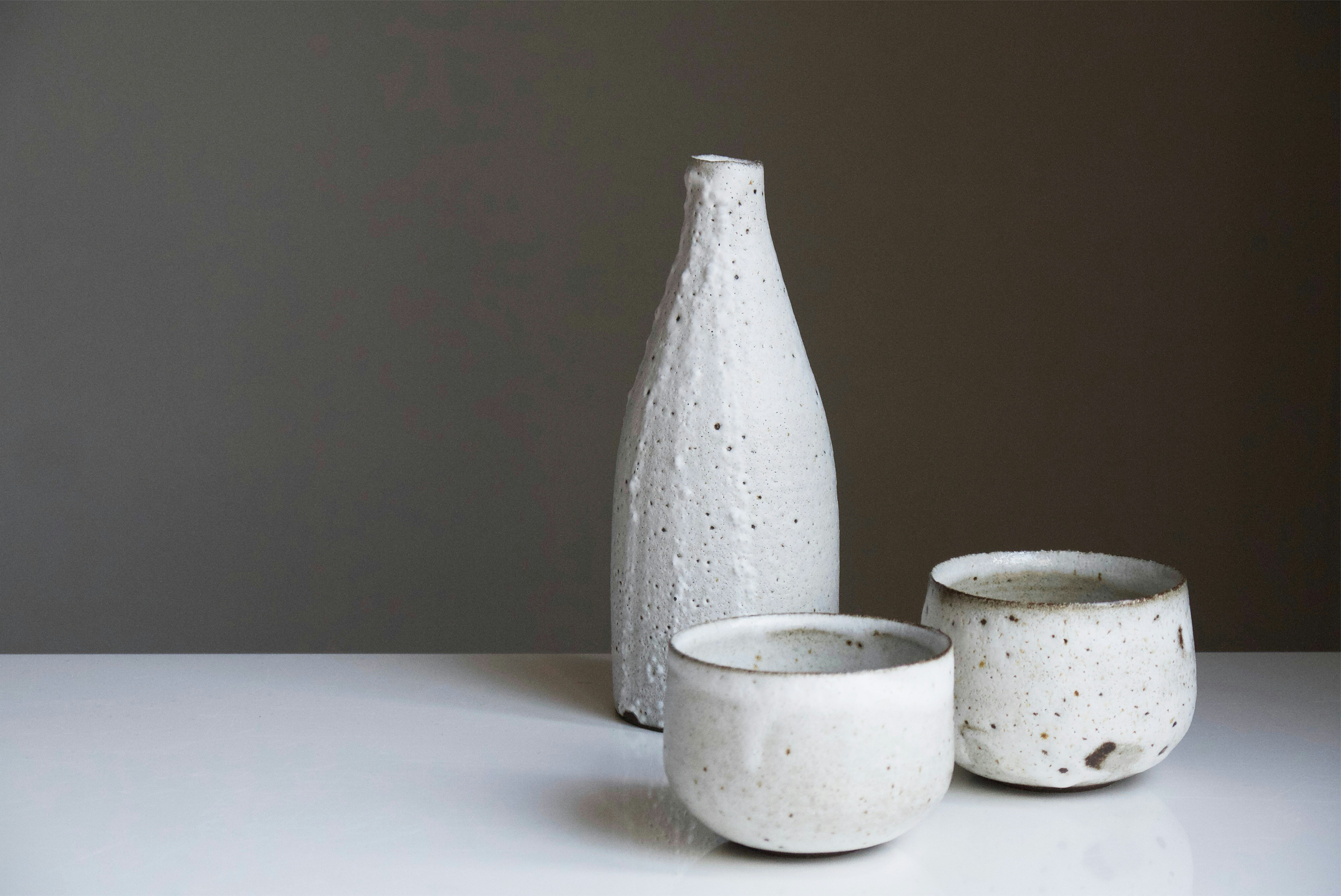
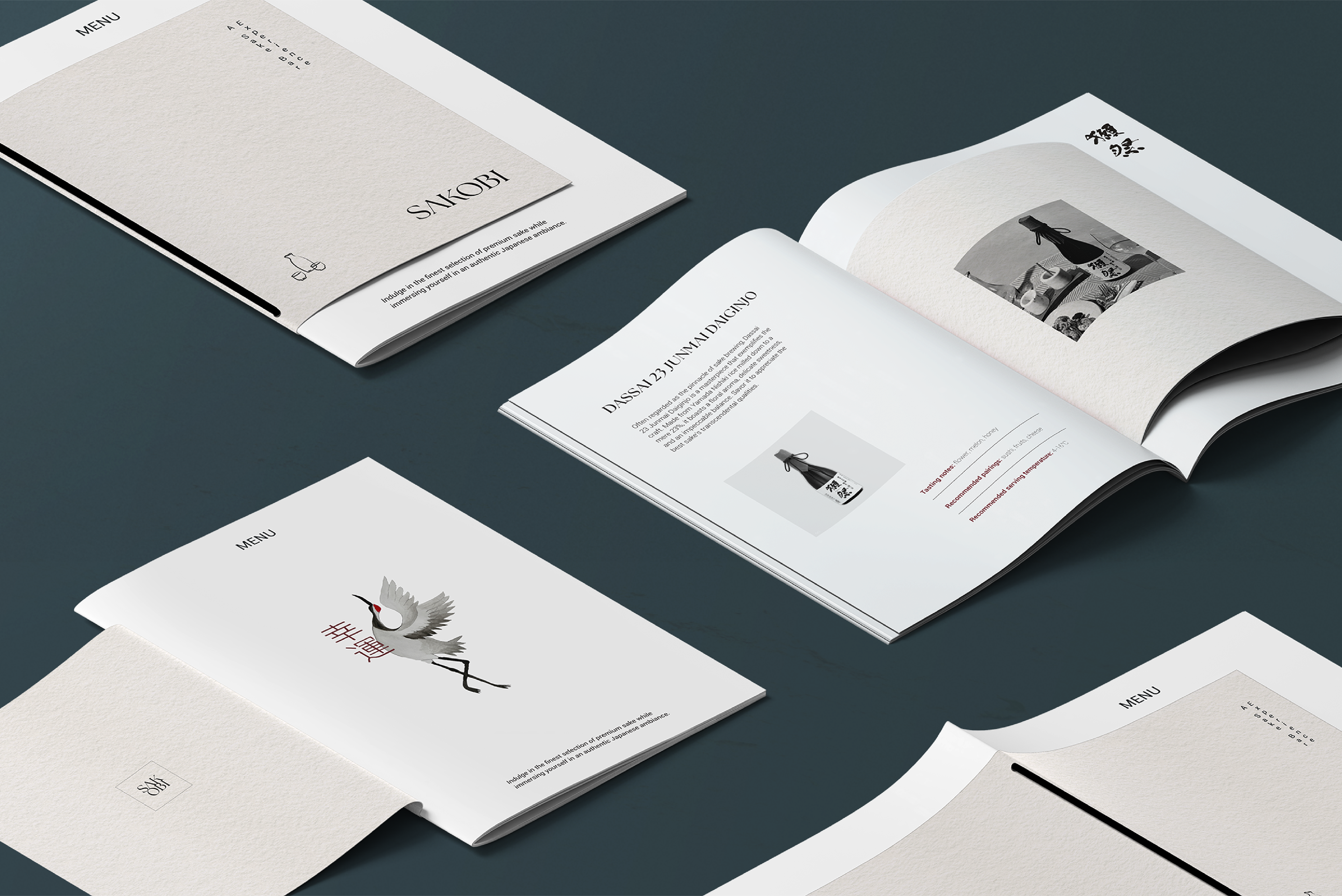
The colours are deep and harmonious, giving a feeling of calmness and sophistication. The typography includes an elegant serif font paired with a simple sans-serif to create hierarchy and balance. Images were also painted, based on Japanese ink-paintings, to be used on the menus and could be incorporated into the bar's interior.
The elements together form a strong brand identity to be used for digital and print mediums.